All tagged xamarin forms 4
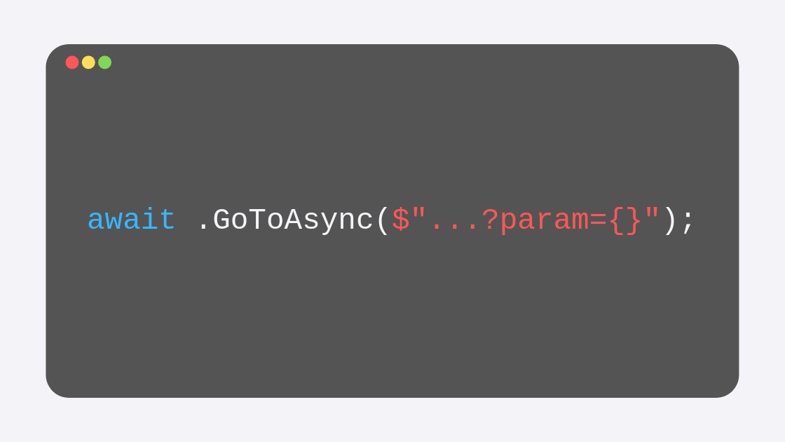
In the previous post I explained how you can use routing to navigate from any page inside the Shell to any other page (within or outside the Shell itself). Now I want to focus on the steps that you need to perform to get data flowing between the two pages.
This is of course crucial, as you create your application, many times, you will want the origin page to send data to the destination page, whether to display it or to use it to do something else, like read from a database the elements that contain a specific keyword or something.
Since my previous posts about the new Shell, Xamarin Forms 4 has been released, and with it the release (non-beta) version of the Shell, which comes immediately with some improvements. Without changing the code that I created in the previous post -in which I created a few elements that were shown on the flyout menu, as well as some tabs and “secondary” tabs- the interface now looks better. It finally includes that hamburger icon, and the list of items looks ok on notched-iPhones, something that was missing at least on the Xamarin Forms 3.6 version I used in the post I mentioned:
In my previous post I talked about how you can start using the new Xamarin Forms Shell in your apps, how to set it up and how to use it to create some tabs. In this post I want to take a closer look at this new navigation paradigm so you can start using it freely to create the apps that you need. We will take a look at its structure and its core features and explore how the flyout view works and how you can create one.
While Xamarin Forms has evolved greatly, and more and more plugins are created for us to be able to use native functionality directly from the .NET Standard Library, there will be from time to time a specific functionality that is not yet available through shared code.
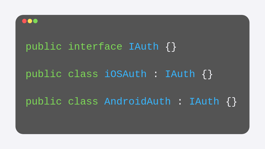
This doesn’t mean that you must think of an alternative, say native Xamarin. Xamarin Forms after all still has those native projects. So what do you do? You code the native functionality and inject it over to the .NET Standard Library using Dependency Injection.
Almost any app that you may have will look bad on iPhones with a notch if it is not correctly configured. All those iPhones that have launched after the iPhone X back in 2017 have notches that caused Apple to change the way apps look just a little bit.
It is your job as a developer to adapt your applications to this change. Thankfully, it is quite easy to do, literally it takes only one line of code in your Page’s files and that is it.
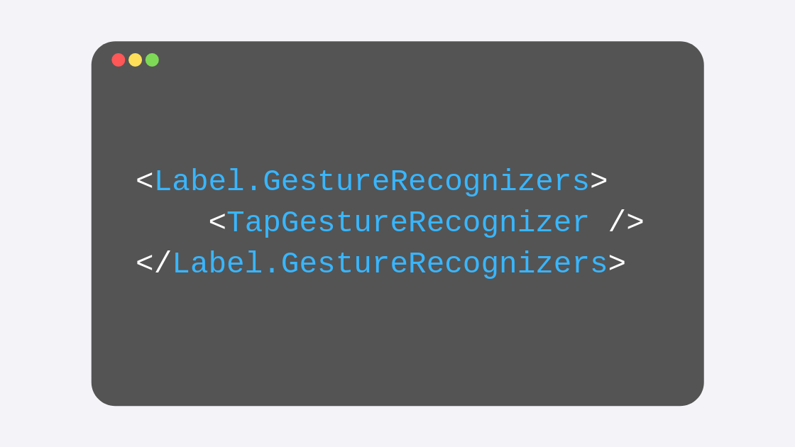
Quite often you may want a XAML label to respond to touch gestures. It may be the case that your label must behave as a hyperlink to a website, or perhaps your terms of service and privacy policy (which is a typical scenario in which we add hyperlinks).
By default, XAML labels do not have any events that we could use in this scenario, so your first option may be to create a button and try to make it look like a simple Label (on iOS this is easier than on Android, where buttons always have a background and very distinctive edges).
I don't know about you, but the selected element color of a ListView, when rendered on an Android device, can feel like too much, not to mention just off with the other colors. I don't mind the light gray color for the same behavior when rendered on iOS, but on Android, it just feels wrong.
Recently a student of mine asked a fascinating question that I hadn’t come up with, but that seemed to be easily implementable and super useful in at least one typical scenario: send your users over to the Play Store to get the latest available update to your app.
Using XAML in Xamarin Forms we can change the accent color of the Progress Bars we define, and being able to set it to a HEX value, the possibilities are endless (well, not exactly, only about 16 million, but you know what I mean).
But what if you want that color to change dynamically, say, depending on how much the progress bar is filled, especially if you're going to keep your code-behind as clean as possible, so no handling of events and messy code.
Something that I haven't always liked about Android is the top-side tab bars. You know, those that can take you from one page to another very easily without reaching your finger too far onto the screen or opening a side menu. I love bottom tab bars, iOS has always had them, and I use them a lot.
In the previous post, I showed you how you could handle multiple states for a specific element using the VisualStateManager and defining various groups and VisualStates.
In this post, we will use this same feature to change the UI of an example application so that it hides a title when the device is on portrait mode, so there is more space for the main component of the interface, which will be a ListView.
If there is something that can take a good-looking app to an incredible-looking app that may very well be Visual States. By defining different Visual States you are able to define how a certain element must look depending on some interaction from the user. The simpler example is with buttons, with which you are able to see when someone hovers over them (perhaps they change color), someone presses them (maybe in addition to colors the scale also changes), maybe also when they lose focus.
It could be a bit of a pain to try to use Images as buttons, for those scenarios when you needed to display a certain image but also needed the user to be able to click on it, with all that that implies. A nice animation, perhaps change of color, and of course the triggering of an event or the ability to bind a Command. As of Xamarin Forms 3.4, this is no longer a pain, now you can define an ImageButton like you would define any element in the interface, and use it similarly to how you would use an Image, and make it respond to how a Button would.


